OZ bags

Dasha Ozerianko’s OZ Bags had a clear aesthetic but no defined identity to hold it together. The foundation was there—the craftsmanship, the personality—but the brand needed structure and a visual system it could grow into.
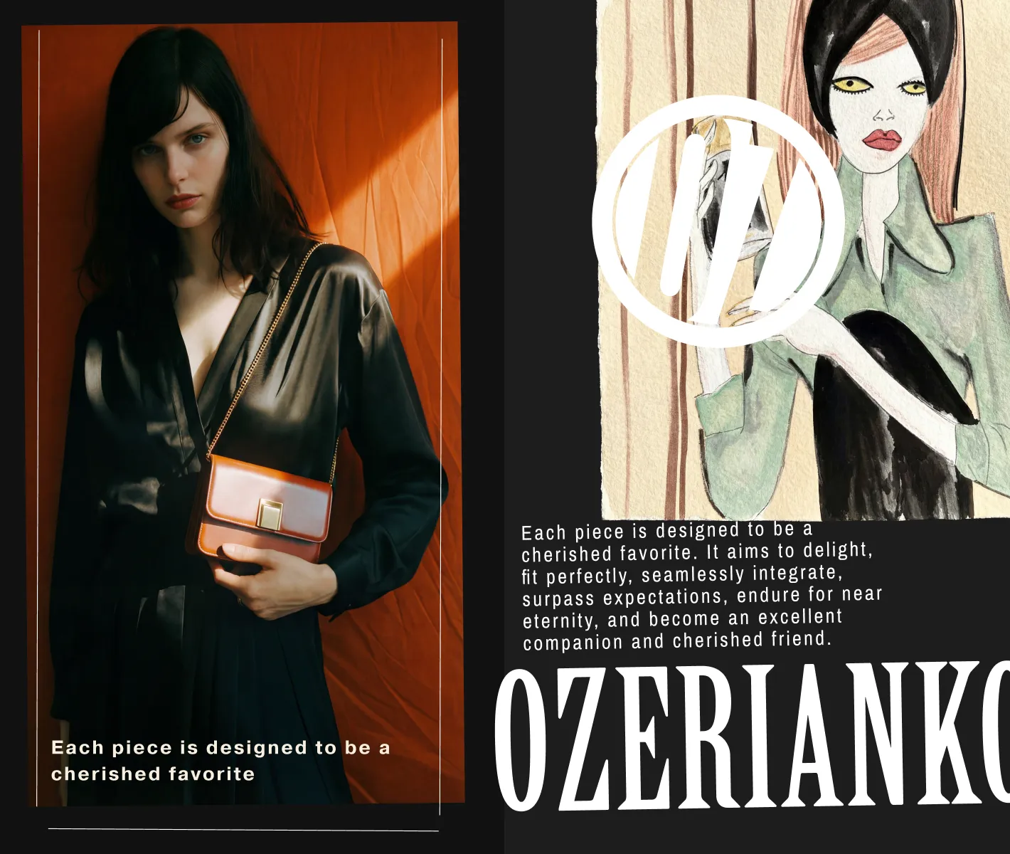
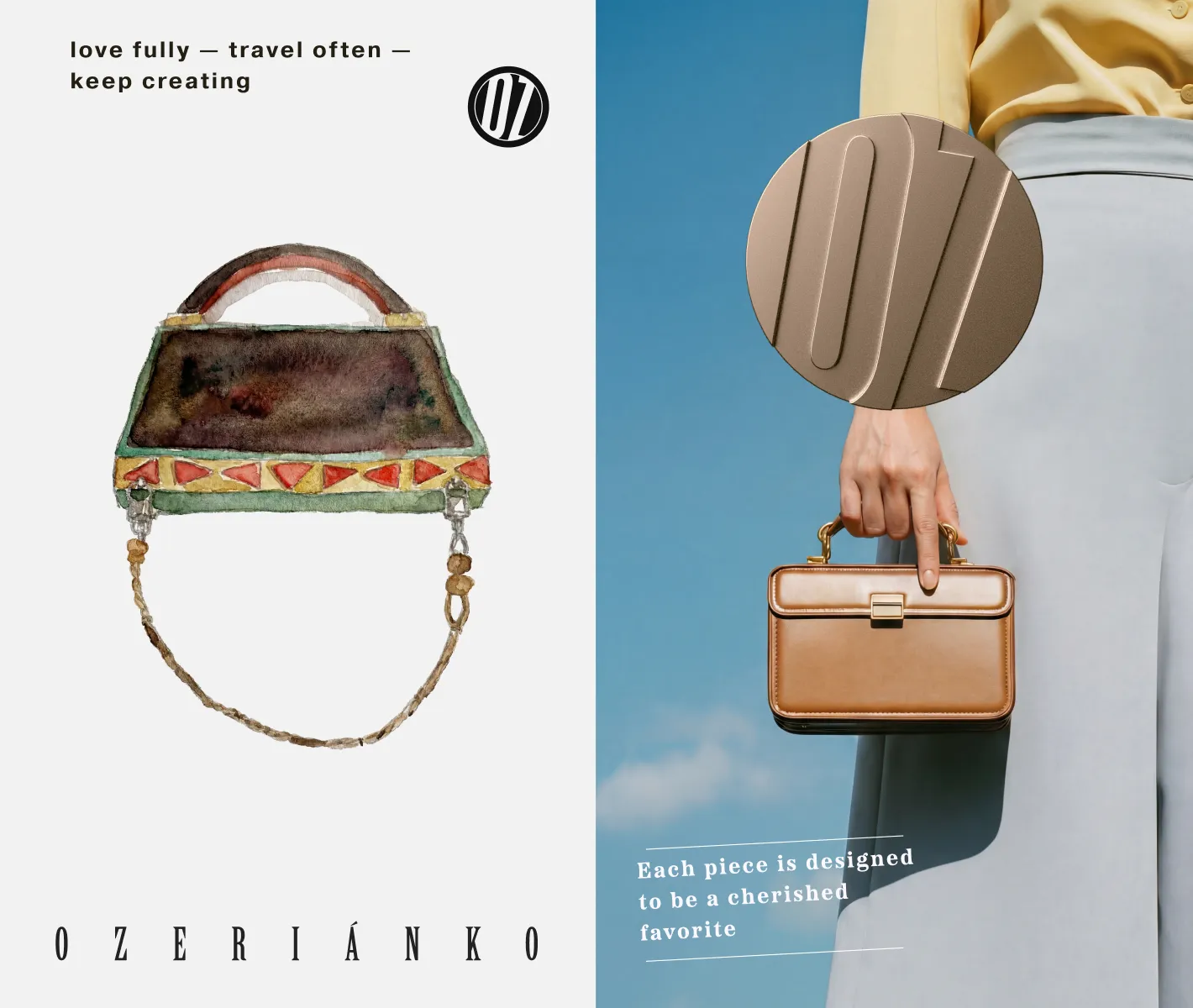
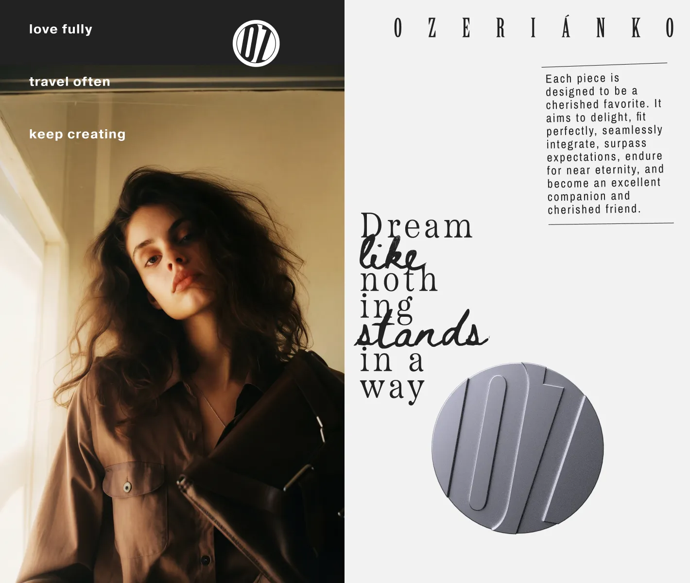
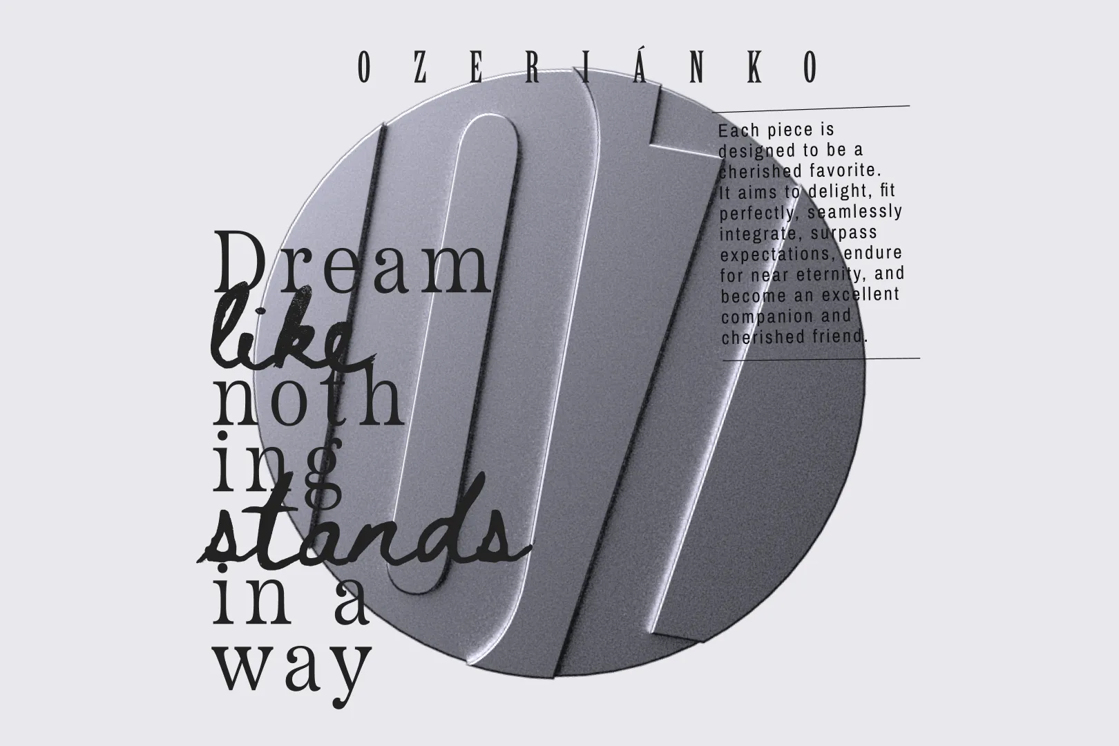
Alongside the new logo, we created a metal-ready monogram with a distinctive angled form. From there, the identity developed into a flexible system built on two pillars: atmospheric photography and a specific illustration style that adds contrast and character. Bold typographic pairings tie everything together, giving the brand a visual rhythm that feels intentional rather than improvised.
The result is a clearer, more consistent identity — one that keeps the brand’s spirit intact while giving it a framework to express itself with confidence.