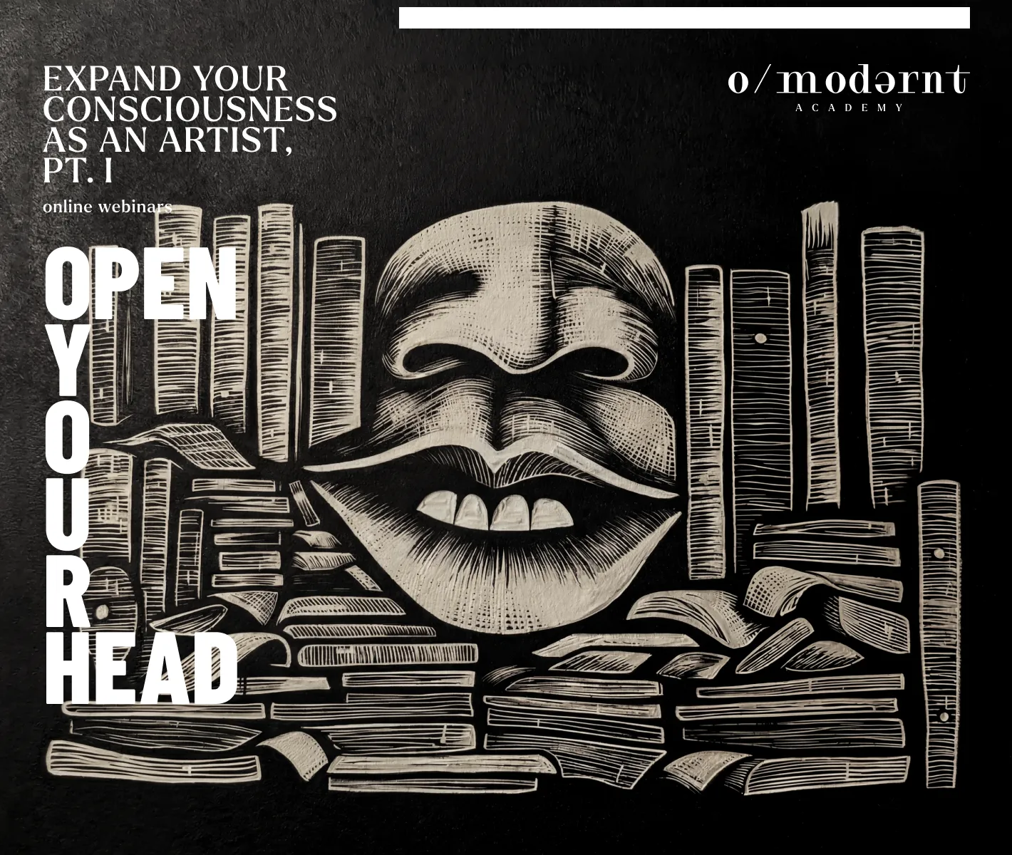
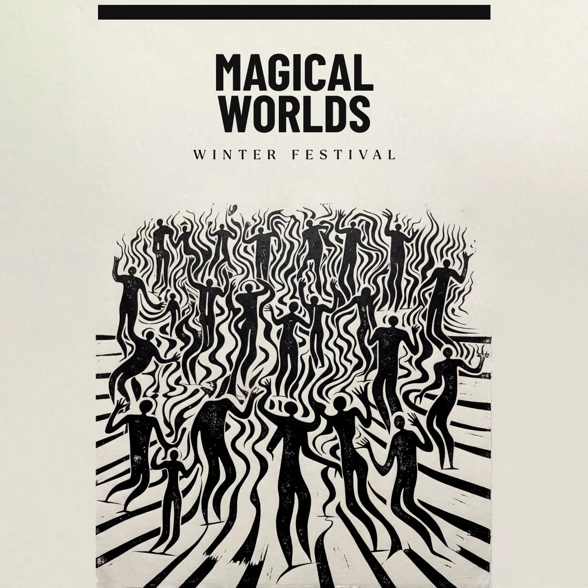
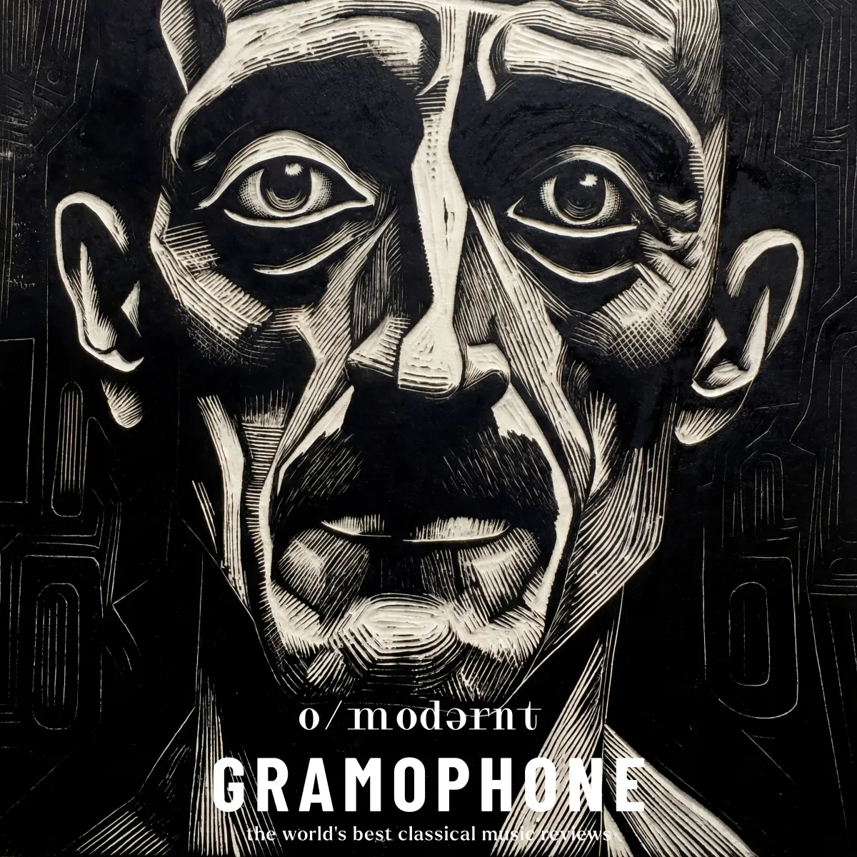
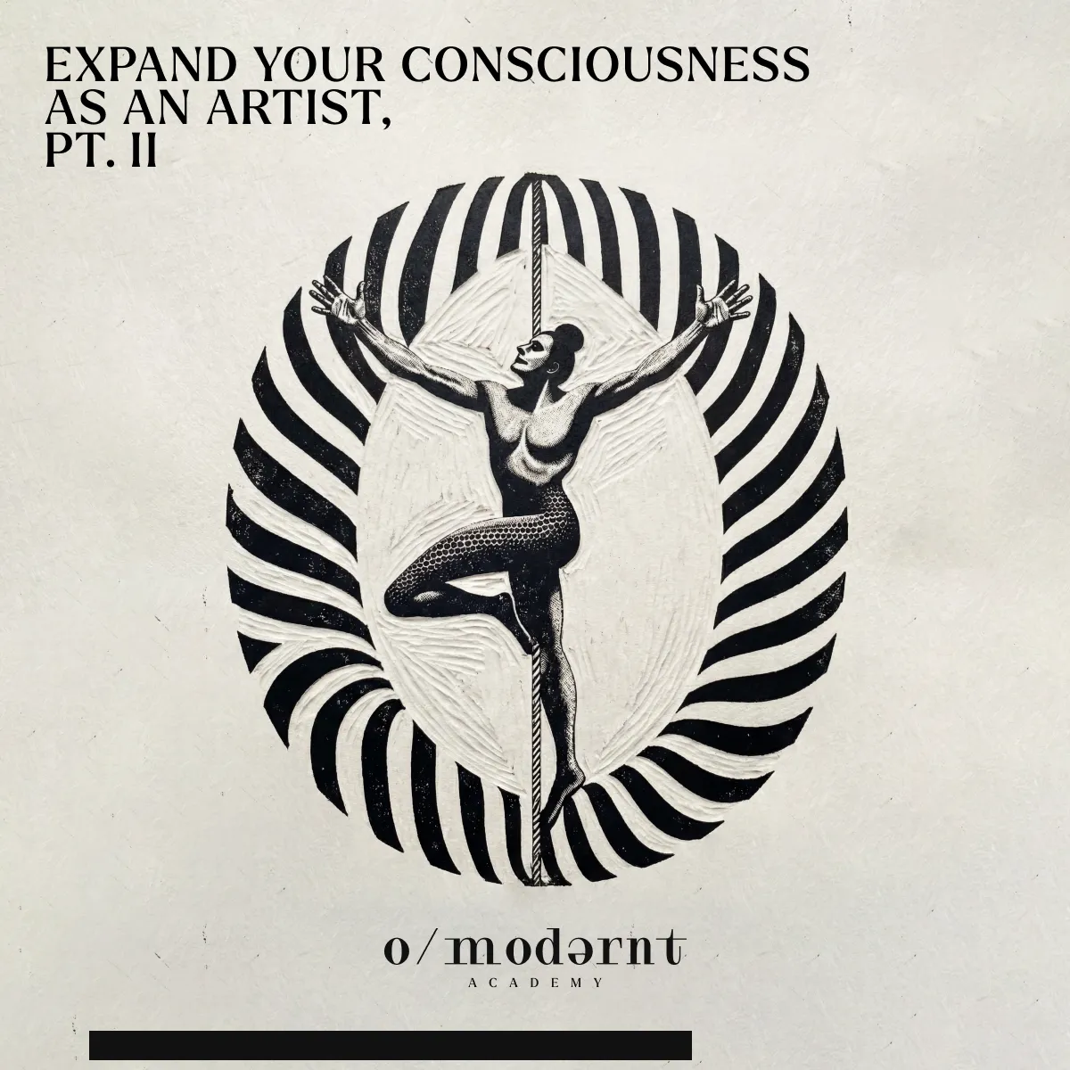
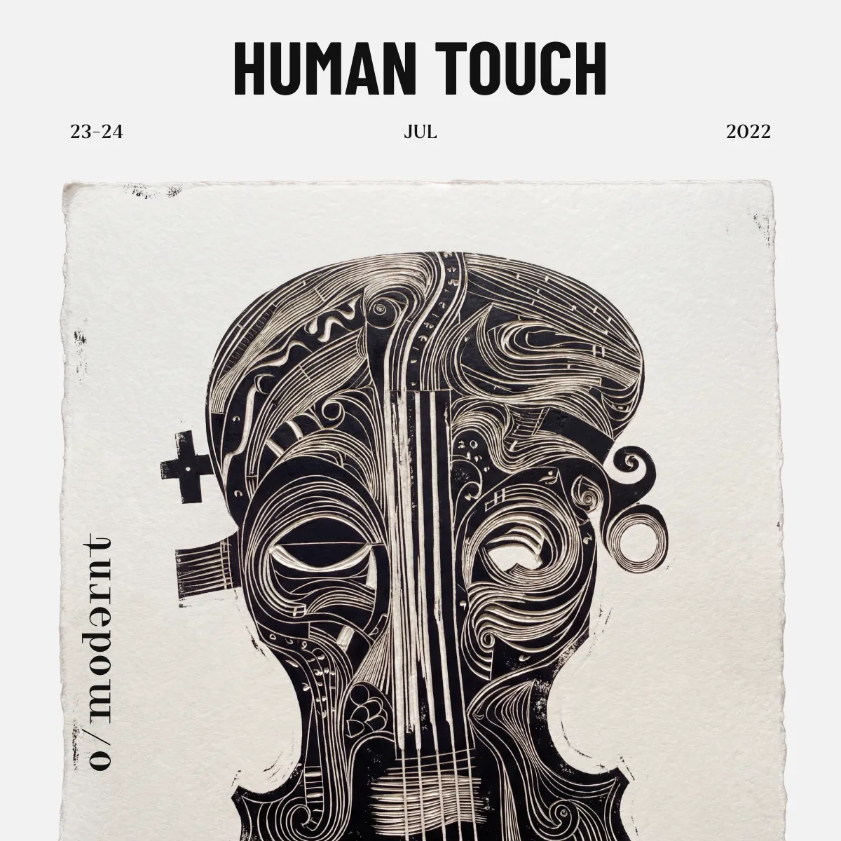
O/modernt
O/modernt (Swedish for “Un/Modern”) is an initiative founded by Hugo Ticciati that explores how past and present inform each other across music, art, and culture. The identity concept I created for them uses this dialogue as its foundation.
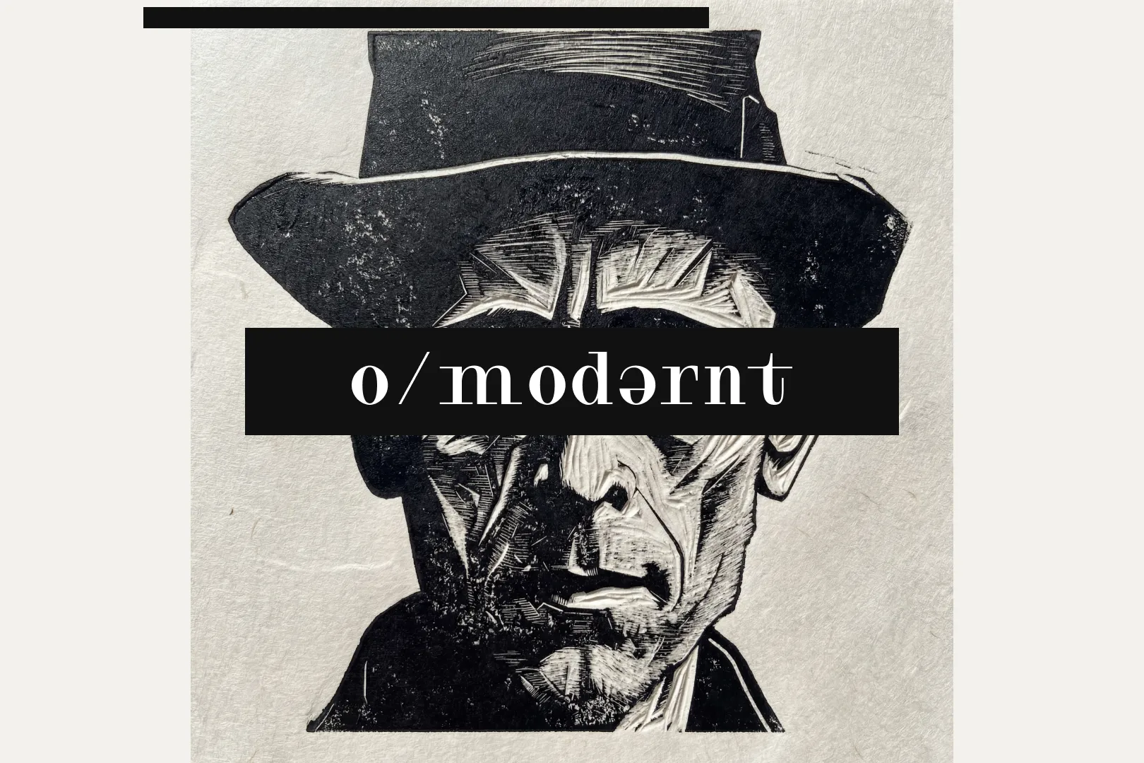
The visual system draws from two complementary aesthetics: the precision of pencil drawing and the bold, textural quality of linocut illustration. Together, they reflect O/modernt’s core idea — reinterpreting tradition through a contemporary lens. The black-and-white palette reinforces that tension, giving the materials a sense of history while keeping the compositions sharp and current.
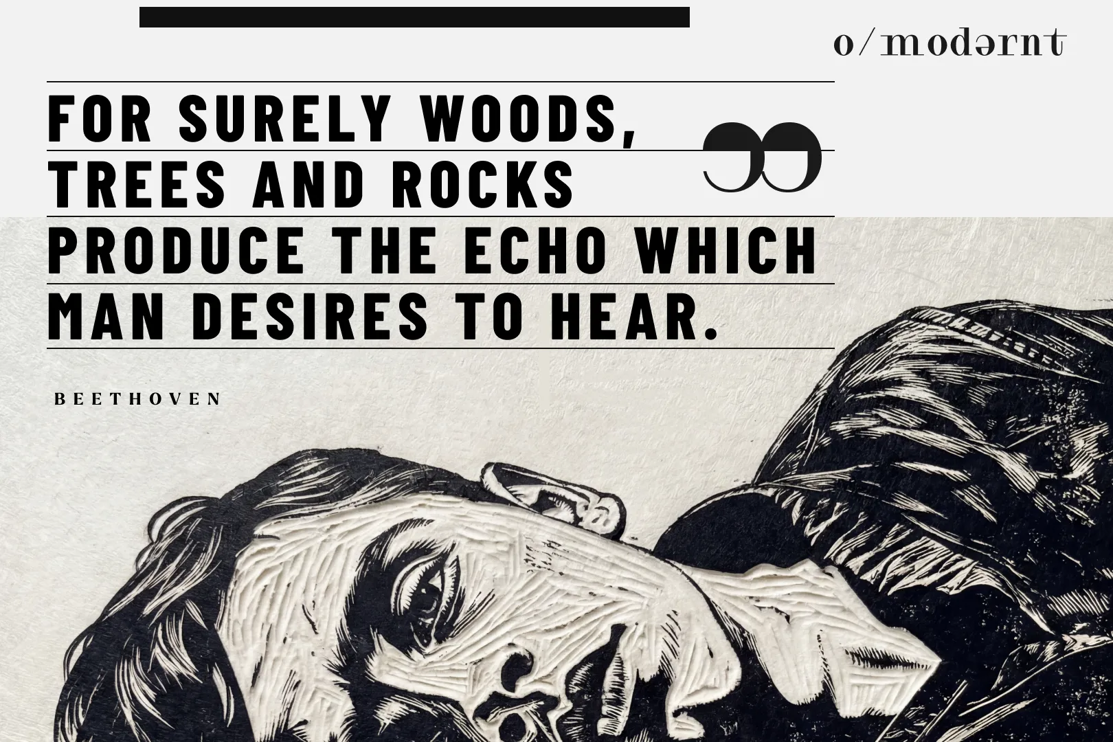
This approach became the basis for posters, editorial layouts, and promotional materials, giving O/modernt a clear visual language that feels rooted, expressive, and adaptable to the wide range of performances and events they curate.